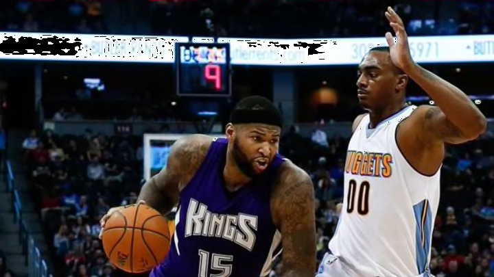
As the Sacramento Kings get ready to move into their fancy new downtown stadium next year, they unveiled a new look to go with their new digs this week.
The Kings had been using their current logo since 1994, and decided it was time for an upgrade as the team progresses towards a new era of team history. They had a large gathering outside Golden 1 Center on Tuesday morning, with owner Vivek Ranadive and many former players like Doug Christie on hand to help celebrate the unveiling.
Now for the part you came for: the logos themselves.
The new look for Sacramento is as follows:
The @SacramentoKings officially unveil their new branding/logos. Franchise got this one right - love the new look. pic.twitter.com/tEjVQkmMlM
— Rachel Nichols (@Rachel__Nichols) April 26, 2016
The new primary is in the center and is a clear modernization of the original Kings logo from when the team moved to Sacramento in 1985. To the right is a ‘city pride’ alternate featuring the common abbreviation for Sacramento, SAC.
On the far right is a new concept, a lion head mixed with a basketball. To the left, a standard crown similar to the top of the primary logo. Furthest left is a lion dribbling a basketball, in a style very similar to royal lions seen on European soccer uniforms. This lion is supposed to represent the Kings as they continue to appeal to global markets, according to the description of the logos on the team website.
So, now that you’ve seen these new logos, featuring a slightly darker purple and a lot more granite gray than black, what do you think of them? We asked Twitter and got quite a mixed response.
As you can see, people were very split on the issue. On the team’s Facebook posts, comment wars waged between those that liked the modernized version of a retro favorite, and those who wished it had more black or powder blue in it.
Of course with a new identity, there will be new uniforms coming soon. The Kings wore their traditional black and purple from 1994 until 2002 when they put more details in the uniform templates. Finally in 2008, they ditched the look almost entirely, going with a new Adidas-driven template that featured new wordmarks and sharper styles. After toying with this new style for a while, they decided to go with a bigger, bolder wordmark in 2014.
With all of that, there’s a lot of room to work with. The Kings classic uniforms are the plain purple and black ones worn by the golden era of Kings basketball, the early 2000’s. That being said, with a new arena, the franchise clearly wants to bring a new look to the team that hasn’t made the playoffs since the days of Kevin Martin and Mike Bibby sharing the backcourt.
With any luck, the new uniforms will look traditional when DeMarcus Cousins and Rudy Gay trot them out come fall.
Several uniform and logo designers on Twitter pieced together a hint the Kings website teased with some insider source information, and apparently the new uniforms will look something close to this:
Using the "leaked" Kings uni image, here's my guess at the look of the full top: pic.twitter.com/NlqxlQzJoF
— Conrad Burry 🔴🐐🎨 (@conradburry) April 27, 2016
Well, that’s certainly different! The new granite color is clearly being used, like in the new logos. So, with all of this new information, what say you, reader? Let us know what parts of the uniform and logos you like, and what parts you think should have stayed on the drawing board. Either way, we are certainly in a #NewEraOfProud indeed.
Next: John Calipari Could Solve Kings' Problems
If you really like the logos, jump on your opportunity to go get a free tattoo, courtesy of Ranadive and the ownership group.
